Weave: Visualizing data for civic impact
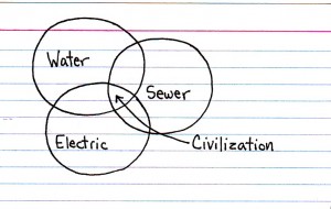
“Utilitarianism,” from Jessica Hagy’s brilliant site This Is Indexed.
I’m a huge fan of Visual.ly, a blog that’s devoted to infographics. We live in a world where our ability to make choices from everything about our health to who we’ll vote for — depends on our grasp of what I’ll call The Big Numbers.
Dense walls of text about your risk of developing heart disease or about health care costs often leave me more confused than when I started. Infographics are great because they can give you an understanding of a topic at a glance. There are many important social issues that can’t be effectively communicated any other way — the biggest stories of our times are, in fact, about Big Numbers: the economic crisis, global climate change, healthcare, the foreclosure crisis.
So if infographics are so great, why do so few sites use them? Because generating them and designing them is hard. Current technology makes it easy to publish text to the web, just as I’m doing now. Most of us are carrying a combination still camera and video camera in our pocket, and depending on the plan you signed up for with your cell phone carrier, you can now videotape a breaking news event and upload it directly to the web instantly.
By contrast, creating infographics means combing public archives for data, pulling down Excel spreadsheets (if you’re lucky), trying hard to make the resulting graphics look right and…well, you get the idea.
Very few organizations have the resources to create infographics, especially interactive infographics, like this web feature from The New York Times showing before and after visualizations of the area surrounding the Fukushima nuclear plant after the natural disaster that occurred there earlier this year. No other piece of journalism even came close to demonstrating the scale of the disaster to me.
One KCIC project is trying to tackle this problem, and that’s the group working on Weave in Lowell. Weave is open source software that allows people to visualize large sets of data. But just because it’s free doesn’t mean it’s accessible — Weave was originally developed for a small audience of highly technical users.
The team working on Weave at the University of Massachusetts at Lowell computer science department wanted to change that — to make Weave easier to use, and to make the output web-accessible. Not only could Weave embed infographics in a website, those infographics could be live, and if posted on the web, any visitor could slice, dice, and play with the data to come to their own conclusions about important public issues.
So do you want to see it? I thought so! The team’s “beta customer” is the Rhode Island Data Hub. The Hub uses Weave to make “data stories” from Census data, reports about the state’s schools, and more. These are, in essence, slide presentations that walk you through one particular set of data. But click on the Weave tab and you’ll actually start to see and play with Weave itself.
Weave isn’t the only data visualization tool out there that’s aimed at a broader audience (it’s not even the only one the Knight Foundation is funding). Here are just two to look at. If you’re interested in figuring out how to present Big Numbers, you can check out IBM Research’s Many Eyes service. Many Eyes only lets you create a predefined set of visualizations, and the resulting visualizations are static and not dynamic. Nonetheless, it gets points for ease of use — in fact, teachers are even using it with students in primary schools as part of lesson plans.
Knight is also funding BuzzData, which goes further and allows you to create interactive infographics, along with trying to embed links to social media to make your visualization easily shareable across social networks.
Recent Content
-
 Communitiesarticle ·
 -
 Communitiesarticle ·
 -
 Communitiesarticle ·